Have you ever wondered what makes a great website? If you’re looking to create an impressive online presence, you’re in the right place. Today, we’re going to explore some of the best websites built using Kajabi, a popular all-in-one platform for online businesses. These examples will inspire you and show you what’s possible with the right tools and creativity.
Kajabi is known for its user-friendly interface and powerful features. It helps entrepreneurs, educators, and content creators build beautiful websites, sell courses, and manage their online businesses. Before we discuss the 15 best websites built with Kajabi, click the button below for a special 30-day free trial of Kajabi. Normally, Kajabi offers a 14-day free trial, but if you click the button below, you’ll get a 30-day free trial. Don’t miss out on this opportunity!
1. Yoga With Adriene
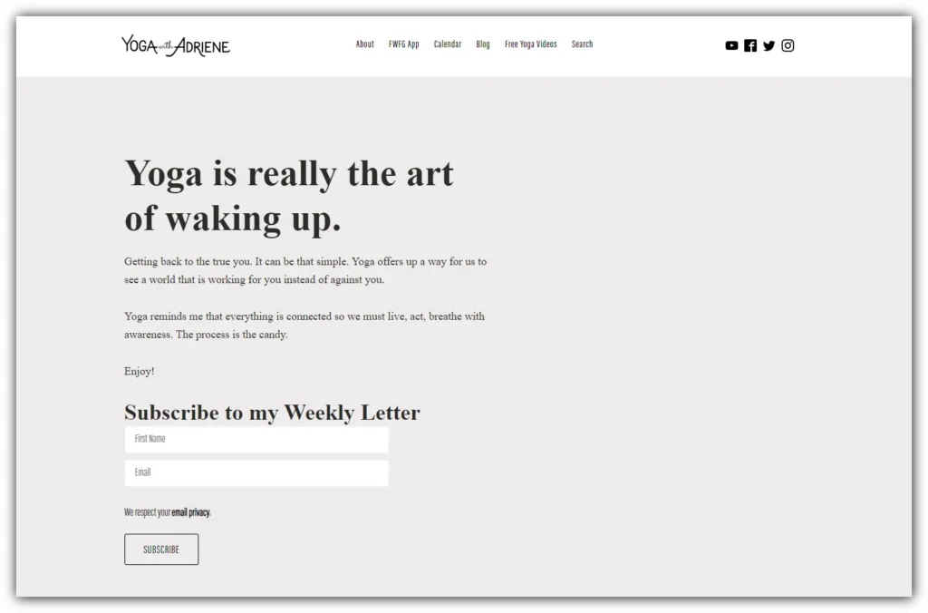
Adriene Mishler is a well-known name in online yoga instruction. Her website, Yoga With Adriene, is a great example of a welcoming and user-friendly fitness site made with Kajabi.
When you visit her homepage, you’ll see a clean and calming design that reflects the essence of yoga. The soothing colors and ample white space make the content feel open and inviting, just like yoga. This design choice helps relax visitors and creates a sense of peace.
One standout feature of Yoga With Adriene’s website is its seamless blend of free and paid content. The site offers plenty of free resources, including a popular YouTube channel with millions of subscribers. This free content is a great way for newcomers to try out Adriene’s teaching style before considering a paid program.
For those wanting to deepen their practice, the site offers premium content through the FWFG (Find What Feels Good) membership. This paid option includes exclusive videos, a supportive community, and extra resources for yoga practitioners. The shift from free to paid content is smooth and natural, never feeling pushy or sales-driven.
2. Grant Cardone
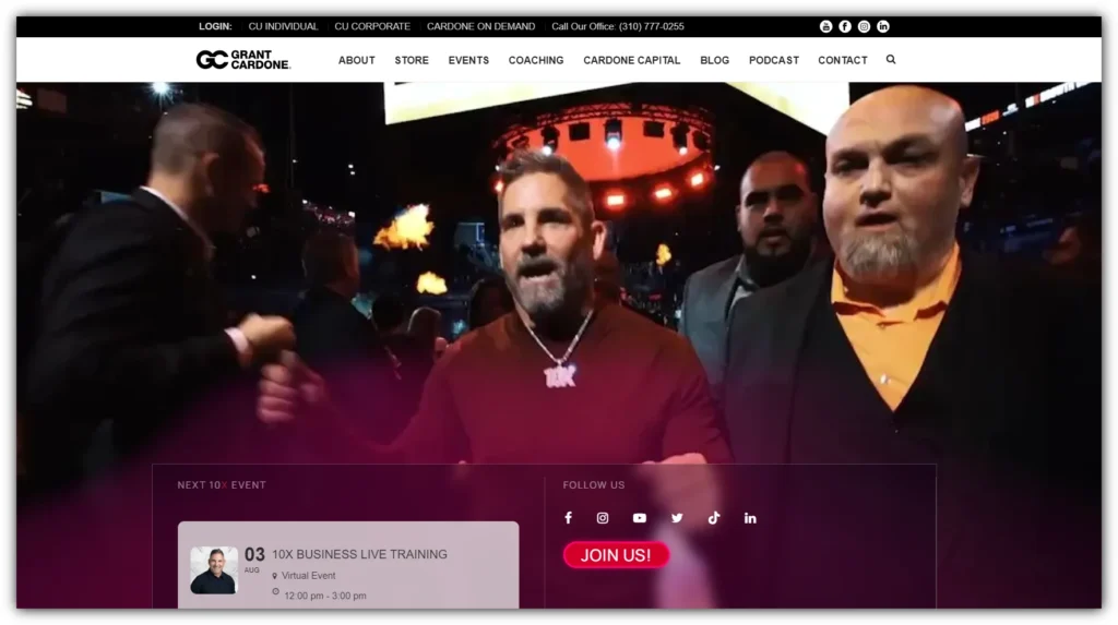
Next, we have Grant Cardone. His website is built with Kajabi. Grant Cardone is a well-known sales trainer, real estate investor, and author. He demonstrates the effectiveness of personal branding and online marketing.
The homepage grabs attention with bold colors, dynamic images, and powerful messages, reflecting Grant’s assertive personality and teaching style. One standout feature is the effective use of call-to-action (CTA) buttons. They guide visitors to key offerings like free training, books, and high-ticket coaching programs using direct and motivational language.
Grant’s site showcases Kajabi’s ability to manage diverse product offerings, ranging from affordable books and courses to premium mastermind groups and live events. The inclusion of testimonials, media appearances, and social media followers builds trust and credibility, essential for turning visitors into customers.
The site offers a variety of free and paid resources, with blog updates covering sales strategies, real estate investing, and personal development. Videos from Grant’s engagements and training sessions add a dynamic and engaging element.
The 10X Growth Conference section demonstrates how Kajabi can support large-scale events, providing essential information and managing ticket sales. Integration with Grant’s strong social media presence encourages multi-channel engagement, reinforcing his brand and keeping his audience connected.
3. Girl Defined
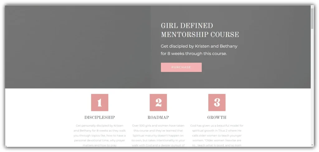
Moving from the high-octane world of sales to a more nurturing space, we come to Girl Defined. Founded by sisters Kristen Clark and Bethany Beal, Girl Defined uses Kajabi to create a supportive online community for young Christian women. This website is a perfect example of how Kajabi can be used to build a niche community and deliver targeted content to a specific audience.
The moment you land on the Girl Defined homepage, you’re greeted with a design that’s both feminine and friendly. The colour palette is soft and welcoming, with pastel shades that appeal to their target demographic of young women. The overall aesthetic is clean and modern, creating a space that feels fresh and relevant to its audience.
Navigation on the site is straightforward, with clear categories that help visitors find exactly what they’re looking for. Whether it’s blog posts, videos, courses, or information about the founders, everything is easily accessible. This user-friendly layout is crucial in keeping visitors engaged and encouraging them to explore more of what Girl Defined has to offer.
4. Fit Men Cook
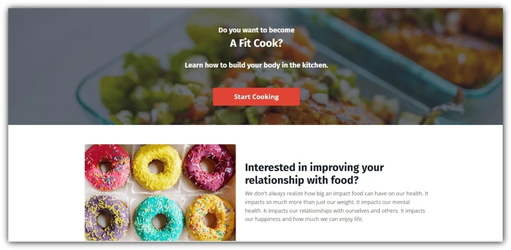
The next website built with Kajabi is Fit Men Cook. Created by Kevin Curry, it showcases how to use Kajabi for a food and fitness brand.
Fit Men Cook offers recipes, meal plans, and fitness advice in an engaging and easy-to-use format that keeps visitors coming back.
The first thing that stands out is its visually appealing design. The site uses high-quality food photography to showcase mouth-watering dishes that draw the eye and stimulate the appetite. This is crucial for a food-focused website, and Fit Men Cook nails it.
Navigation on the site is intuitive and user-friendly. The main menu clearly directs visitors to key sections like recipes, meal plans, and the blog. This ease of use is essential, especially for a site that people might be browsing while planning meals or cooking in the kitchen.
One of the standout features of Fit Men Cook is its extensive recipe section. The site offers a huge collection of free recipes, each with clear instructions, ingredient lists, and nutritional information. These recipes are well-categorized, making it easy for users to find dishes that fit their dietary needs or preferences, whether they’re looking for high-protein meals, vegetarian options, or quick weeknight dinners.
The site makes excellent use of Kajabi’s ability to handle complex content organization. Recipes can be filtered by various criteria such as meal type, diet type, or main ingredient. This advanced search functionality enhances the user experience and keeps visitors engaged with the site for longer periods.
5. Wholetones
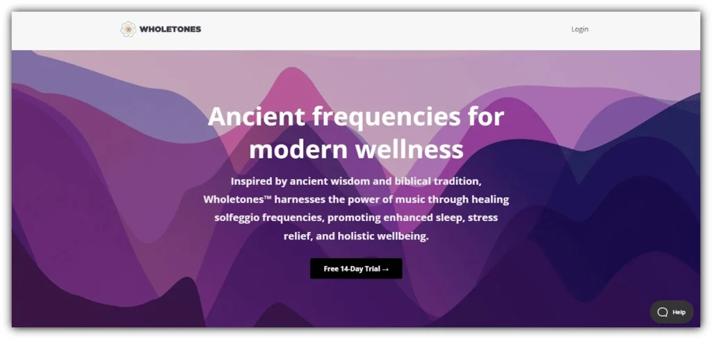
Let’s change the subject from fitness and nutrition to a special product on Kajabi called Wholetones. Made by Michael S. Tyrrell, Wholetones demonstrates how Kajabi can help market and sell unique health products. This site focuses on healing music, showing how the platform can handle niche products.
The moment you land on the Wholetones homepage, you’re greeted with an elegant, music-themed design. The color scheme is soothing and sophisticated, with rich purples and golds that evoke a sense of luxury and spirituality. This visual design immediately sets the tone for the unique product being offered.
Navigation on the site is straightforward, with clear menus guiding visitors to key sections like the shop, about page, and testimonials. This ease of use is crucial, especially when dealing with a product that may be unfamiliar to many visitors.
6. Putting Me Together
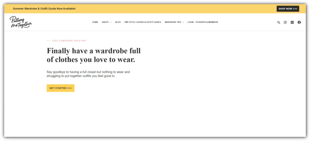
Putting Me Together is a blog dedicated to fashion, style, and clothing. The website is built with Kajabi and is highly cohesive, with an impressively effective layout. The homepage begins with a few free offers, followed by paid offers that gradually increase in price as you scroll down. This strategy effectively engages visitors.
Interestingly, the site features a shop for digital downloads, but it uses Shopify for this purpose. Given that Kajabi is excellent for selling digital products, it seems impractical to use and pay for two platforms when Kajabi alone could suffice. Perhaps the creator previously sold physical items. One noticeable oversight is that the site still displays the Kajabi favicon, an easy yet crucial update for maintaining brand consistency.
This website shows how Kajabi can help content creators monetize their expertise through online courses.
You Might Also Like:
7. Grow Young Fitness
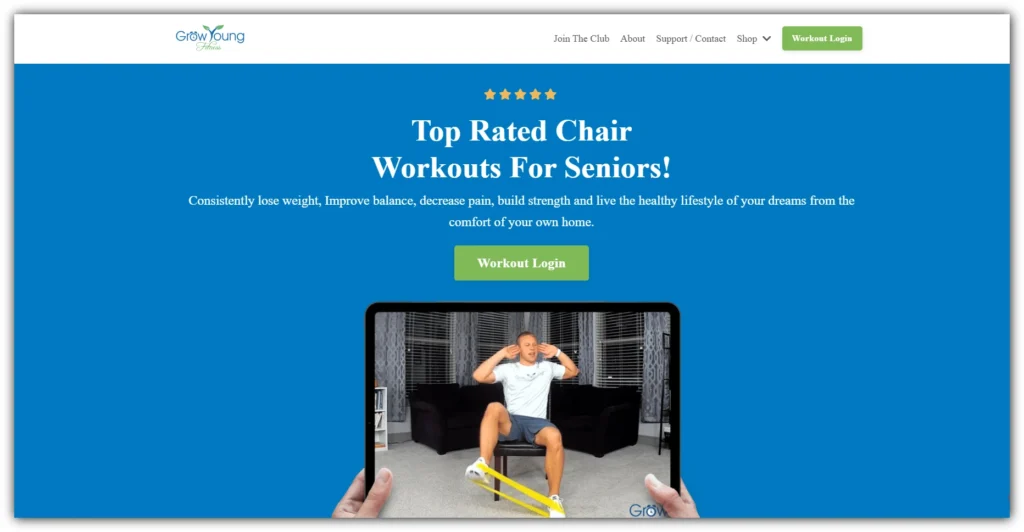
Grow Young Fitness, founded by Deron Buboltz, is a Kajabi website that offers fitness programs specifically designed for seniors. This platform is a prime example of how to cater to a particular demographic using Kajabi’s versatile features.
One of the standout features of Grow Young Fitness is its age-appropriate design, which includes larger text and clear navigation to ensure ease of use for older adults. The website also offers video previews of exercise routines, giving potential users a glimpse of what they can expect from the programs. Additionally, testimonials from satisfied customers provide social proof and build trust among new visitors.
Moreover, Grow Young Fitness offers multiple program options to suit different needs, ensuring that there is something for everyone, regardless of their fitness level or specific requirements. This website exemplifies how Kajabi can be utilized to create accessible and targeted fitness content for a niche audience, making it an excellent resource for seniors looking to stay active and healthy.
8. College Admissions Grown and Flown

College Admissions Grown and Flown utilizes Kajabi to provide valuable guidance to parents of college-bound students. This website serves as an excellent example of leveraging the platform to deliver educational content effectively.
One of the most notable elements of College Admissions Grown and Flown is its clean, professional design, which inspires trust and confidence in its users. The website features a clear breakdown of the services offered, making it easy for parents to find the information and support they need. The platform also balances free resources with paid courses, ensuring that there is accessible content for all users while also offering more in-depth guidance for those willing to invest.
Additionally, the effective use of expert credentials throughout the site helps establish authority and credibility, reassuring parents that they are receiving advice from knowledgeable professionals. College Admissions Grown and Flown demonstrates how Kajabi can be used to create a comprehensive resource hub for a specific educational niche, offering a mix of valuable content to support its audience.
9. Psychotherapy.net
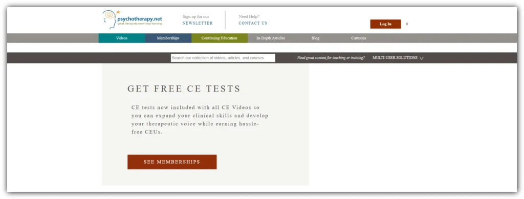
Psychotherapy.net leverages Kajabi to provide continuing education for mental health professionals, showcasing the platform’s effectiveness for professional development and training.
The website features a professional, academic-oriented design that appeals to its target audience of mental health professionals seeking to advance their knowledge and skills. One of the key features of Psychotherapy.net is its extensive library of video content, offering a wealth of information on various topics within the field. Additionally, the platform is integrated with continuing education credits, making it a convenient and valuable resource for professionals looking to maintain their certifications and licensure.
The powerful search function on the site allows users to easily find specific topics, enhancing the user experience and ensuring that professionals can quickly access the content they need. Psychotherapy.net demonstrates Kajabi’s capability to handle complex educational offerings and certification processes, making it an excellent choice for organizations focused on professional training and development.
10. Generals International Partner Library
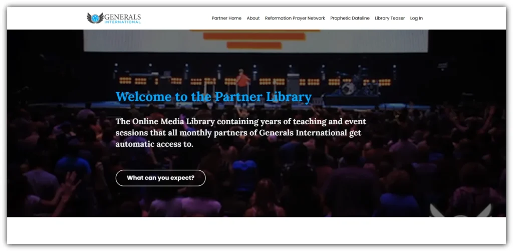
Generals International Partner Library utilizes Kajabi to deliver religious and spiritual content, demonstrating the platform’s versatility for membership-based content delivery.
One of the standout aspects of this site is its sleek, modern design that appeals to a broad audience, making it visually appealing and user-friendly. The library offers tiered membership options, catering to different levels of access and engagement, which allows users to choose a plan that best suits their needs. Regular content updates ensure ongoing engagement from members, keeping the material fresh and relevant.
Additionally, the integration of various media types, including video, audio, and text, provides a rich and diverse content experience for users. Generals International Partner Library shows how Kajabi can be effectively used to create a subscription-based content library, offering a comprehensive and engaging resource for its members.
11. Photo Serge
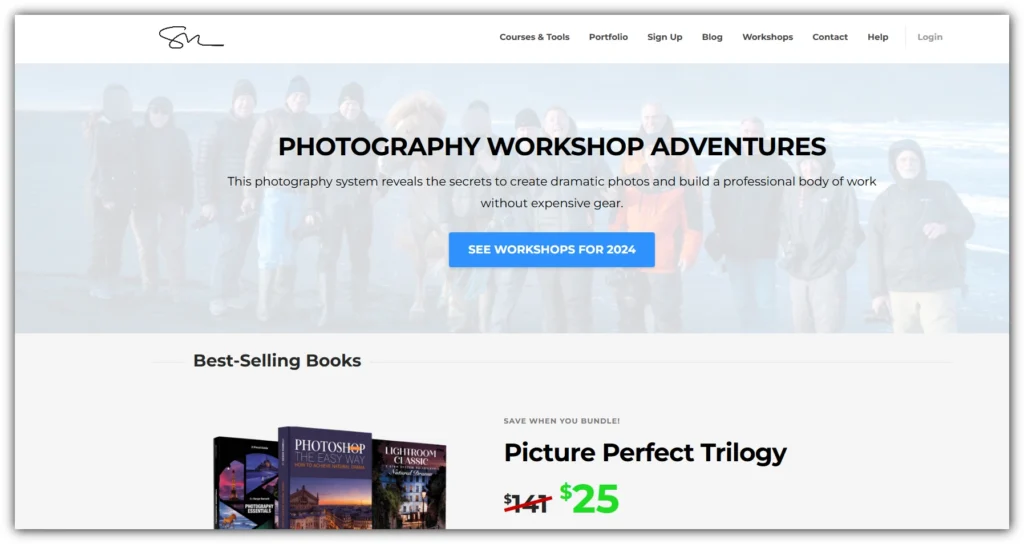
Photo Serge, run by renowned photographer Serge Ramelli, uses Kajabi to offer photography courses and presets. This site is an excellent example of how visual artists can monetize their skills and knowledge using the platform.
What makes Photo Serge unique is the stunning photography showcased throughout the site, which not only highlights Serge’s talent but also serves as an inspiring visual testament to the quality of his teaching. The website features clear categorization of different photography niches, making it easy for users to find tutorials and courses specific to their interests. A balanced mix of free tutorials and premium courses ensures that there is valuable content for everyone, whether they are just starting or looking to advance their skills.
Additionally, the integration of social media helps build a community around Serge’s work, fostering engagement and interaction among his audience. Photo Serge demonstrates how Kajabi can be used to create a visually striking and highly functional platform for creative professionals, effectively showcasing their work and providing educational resources to their followers.
12. Pink Fortitude
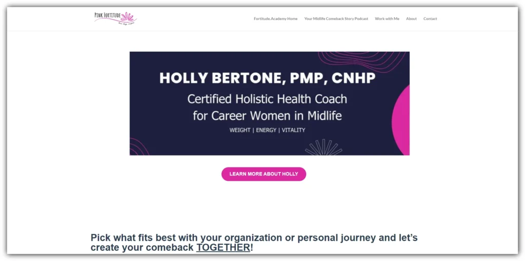
Pink Fortitude, founded by Holly Bertone, uses Kajabi to offer support and resources for women with chronic illnesses. This site is an excellent example of how the Kajabi can be utilized for a cause-driven website.
One of the key elements of Pink Fortitude is its warm, inviting design, which reflects the supportive nature of the community it serves. The site features a mix of blog content, free resources, and paid programs, providing a comprehensive range of information and support for its audience. The clear explanation of the founder’s story and mission adds a personal touch, helping users connect with Holly and understand the motivation behind the platform.
Additionally, Pink Fortitude integrates a shop for physical products, allowing visitors to purchase items that support their journey. This website effectively shows how Kajabi can be used to create a multi-faceted platform that combines content, community, and commerce, making it a valuable resource for women with chronic illnesses.
13. Guitar Sage
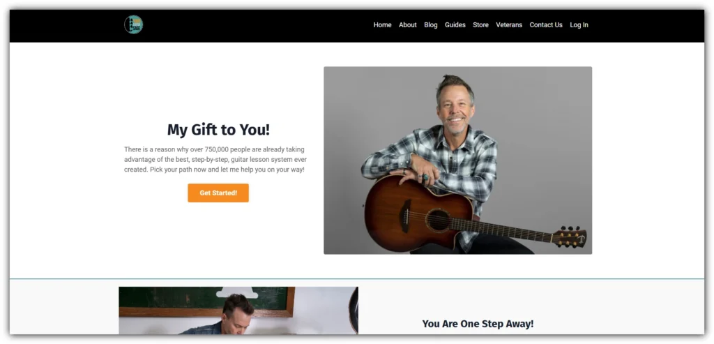
Guitar Sage, created by Erich Andreas, uses Kajabi to provide online guitar lessons. It’s a great example of how the platform can be used for skill-based education.
The website features a guitar-themed design that appeals to music enthusiasts, creating an engaging and visually appealing environment for learners. One of the notable features is the clear progression of lessons, guiding users from beginner to advanced levels in a structured manner. This ensures that students can easily track their progress and build their skills systematically.
Guitar Sage also offers a mix of free content and paid courses, providing value to all users regardless of their budget. The integration of video lessons and downloadable resources enhances the learning experience, offering a variety of ways for students to engage with the material. Erich’s website demonstrates how Kajabi can be used to create a comprehensive and effective online learning experience for a specific skill, making it a valuable resource for aspiring guitarists.
14. Education by Matt Johnson
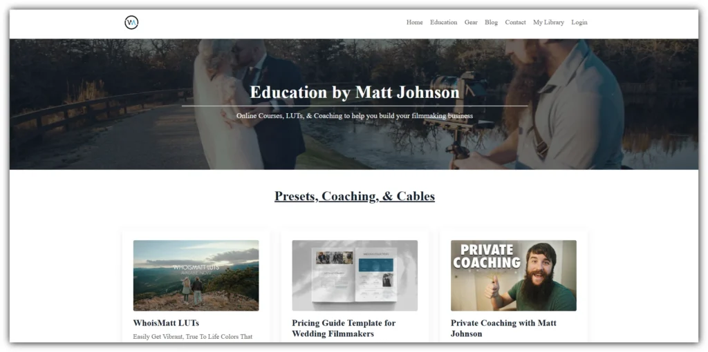
Education by Matt Johnson utilizes Kajabi to offer comprehensive real estate education, showcasing the platform’s capability for professional training in a specific industry.
The website features a professional, no-nonsense design that appeals to business-minded individuals, creating a focused and credible environment for learners. One of the standout elements is the clear explanation of course benefits and outcomes, ensuring that potential students understand the value and practical applications of the training offered.
Education by Matt Johnson effectively uses webinars and live events to engage its audience, providing interactive learning experiences that enhance the educational content. Additionally, the integration of student success stories adds a layer of authenticity and motivation, demonstrating real-world results and encouraging new students to enroll.
This website shows how Kajabi can be used to create an authoritative platform for industry-specific education, offering valuable resources and fostering professional growth within the real estate sector.
15. Flowing Zen
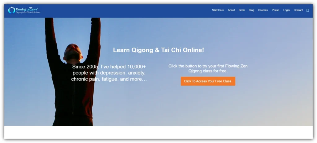
Flowing Zen, created by Anthony Korahais, uses Kajabi to offer Qigong and Tai Chi courses. It’s a great example of teaching traditional practices in a modern, online format.
One of the key aspects of Flowing Zen is its Zen-inspired design, creating a calm and focused atmosphere perfect for practicing Qigong and Tai Chi. The website offers a mix of free content and paid courses, making it accessible for newcomers and providing advanced options for dedicated practitioners. Clear explanations of the benefits of Qigong and Tai Chi help visitors understand how these ancient practices can improve their well-being..
Additionally, the blog provides ongoing value with insights, tips, and information that keep visitors engaged and informed. Anthony’s website shows how Kajabi can bring ancient practices to a global audience through online learning, effectively combining tradition with modern technology to reach and teach more people.
Final Thoughts
These 15 Kajabi website examples showcase the platform’s versatility and power. From yoga and fitness to photography and real estate, Kajabi can be used to create stunning websites for almost any niche or industry.
These examples teach important lessons. Kajabi offers tools to build a great website, but it’s up to you to use them well. If your pages are messy, have broken links, or inconsistent URLs, it can confuse and frustrate users.
My tip is to always test your website thoroughly before launching. This helps you find and fix problems before your audience sees them, ensuring a smooth and enjoyable experience from the beginning.
You Might Also Like: